3 Ways to Use Your Brand Colors in your Personal Branding Session
A few months ago I shared the three elements that make a strong brand, and one of those elements is brand visuals. Brand visuals include your logo, fonts, and especially your brand colors. There are so many ways to use your brand colors to make your business immediately recognizable to prospective clients and as a brand photographer I will argue that one of the best ways is to include them in your brand photoshoot. Keep reading for the three ways to use your brand colors in your personal branding session.
1. Props
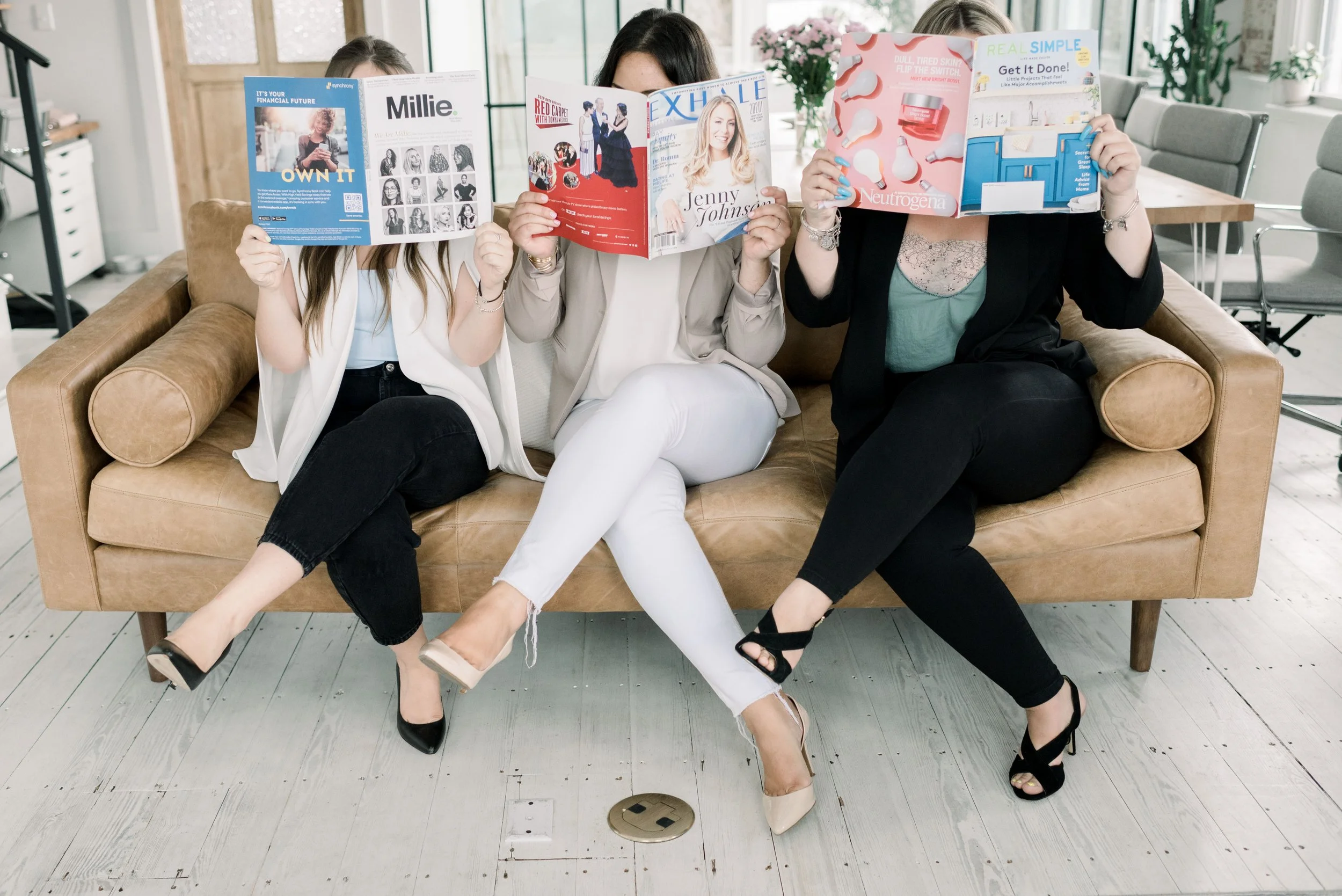
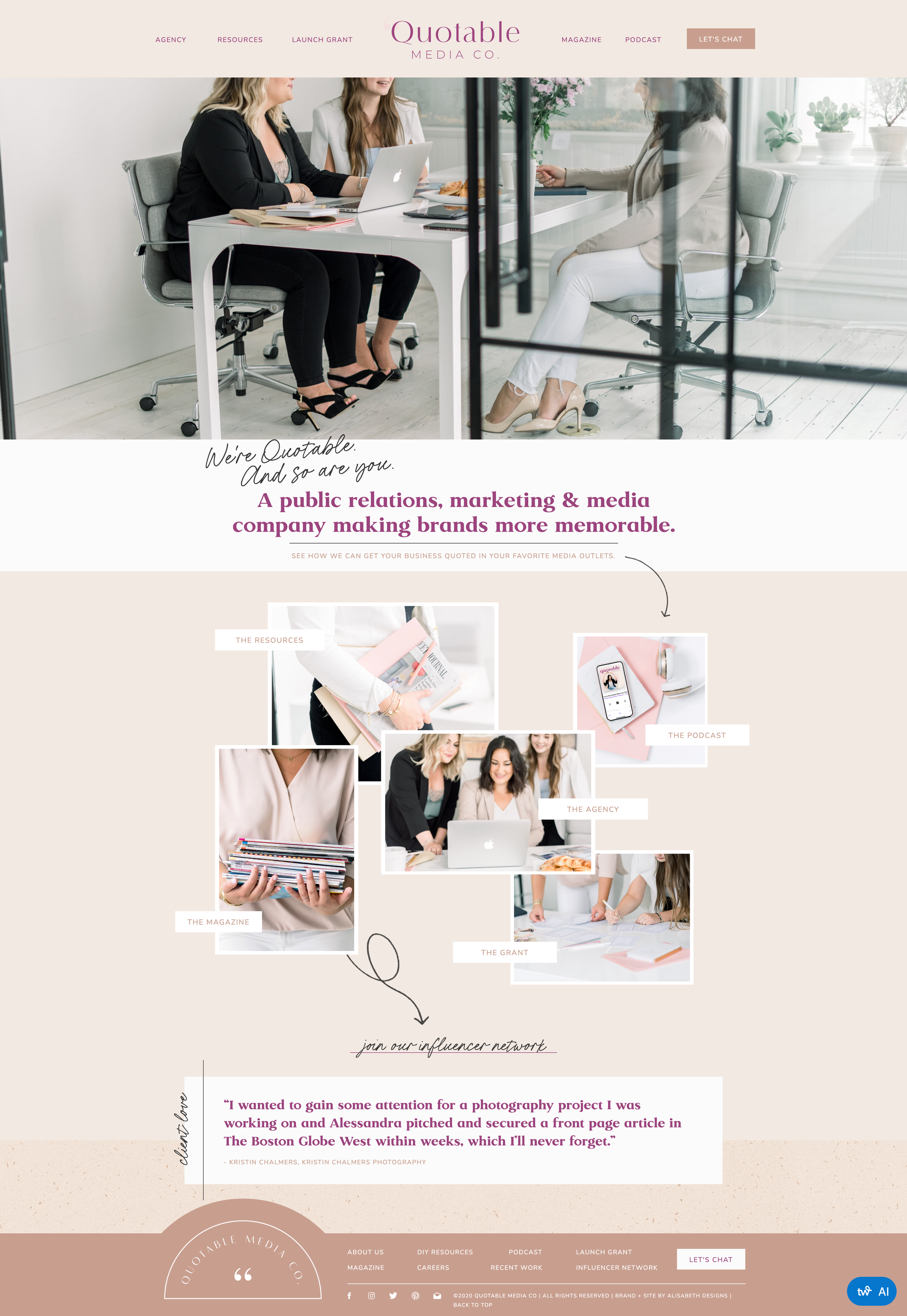
Quotable Media Co. uses lots of neutrals with subtle pops of color in their website so when Alessandra (the Founder) mentioned she wanted to incorporate a lot of props for flatlays and branded stock, we agreed that these props should complement and align with her brand colors. So shen she showed up with mugs, coffee cups, notebooks in soft hues, magazines and newspapers, even pens in their brand colors, I knew her shoot was going to look amazing. Everything came together beautifully and just check out how well the photos worked with her website and brand colors below!
If you want to learn more about how to plan your props for your brand photography session, check out this post on why props matter and how to best employ them in your shoot!
2. Outfits
When I worked with Dr. Myra Brennan of ICU Smile, she focused on her outfits as a way to employ her brand colors in her shoot. As her business is cosmetic dentistry, it was imperative to show her in action with a few of her clients. Notice the light blues and pure whites that both she and her clients wore during her shoot? They match her brand colors perfectly as you can see below!
For more on how to dress for your personal brand, check out my interview with personal stylist, Nicole Otchy.
3. Location
When it came to my shoot with Hayley Denker Marketing it was all about the location. This marketing firm has a bold color palette so when we were searching for a space to shoot in, we knew it needed to be unique. I found this Peerspace that was full of bright colors, as well as rusty tones and blacks, and it worked perfectly with their website - as you can see below.
If you want to learn more about how to match your brand shoot with your brand aesthetics, check out this blog post.
Now that you know three ways to incorporate your brand colors into your personal branding session, click here to grab my shoot plan guide so you can be fully prepared to get in front of the camera!

